
- Moving the markets
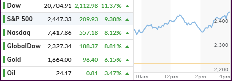
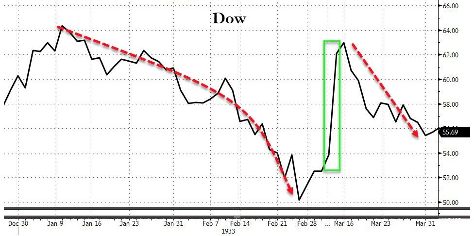
The markets finally managed a solid comeback by using nothing but hope for a $2.5 trillion stimulus package as a springboard with the Dow scoring its best percentage gain (11%+) since 1933. However, history throws a shadow on that event, if you look at this chart and become aware of what happened afterwards.
Optimism grew that congress would come to an agreement on a giant fiscal package focused on alleviating the devastating economic impact from the coronavirus.
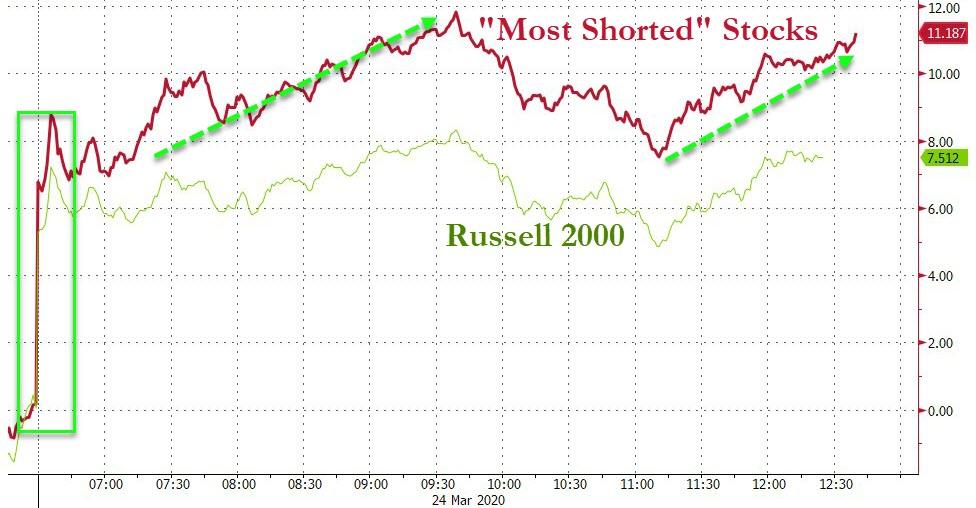
After the relentless selling of the past 3 weeks, it’s not unexpected to see such a snap back, as bear markets historically can demonstrate rebounds of a far greater magnitude than what we see during bull markets. Of course, as we’ve observed all of last year, the biggest ever short squeeze gave an assist today with the most shorted stocks soaring 11%, according to ZH.
While the Fed has gone all out to unleash its stimulus efforts, as I posted over the past few days, it’s now up to congress to grease the wheels for fiscal and monetary stimulus to operate in sync.
Does that mean it will work, and the bear market is over?
I don’t believe so, although some MSM reports and a bunch of traders expect a V-shape type of recovery. While that is possible, I don’t think its likely, and we must wait and see how markets react, once congress gives its nod. Let’s hope we don’t witness the old “buy the rumor, sell the fact” reaction, which can easily put today’s rally back into reverse.
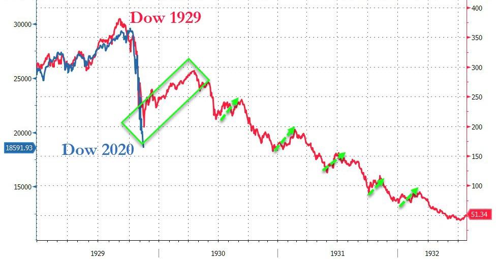
Looking at the analog chart of 1929, we can clearly recognize that a sharp correction was followed by a fake 2-month rebound, before bearish tendencies prevailed in a subsequent 2-year brutal downturn.
Will history repeat itself? Who knows, but no matter how much of a one-day rebound we experience, it’s most likely not the return to the good old days.
2. ETFs in the Spotlight
In case you missed the announcement and description of this section, you can again.
It features 10 broadly diversified and sector ETFs from my HighVolume list as posted every Saturday. Furthermore, they are screened for the lowest MaxDD% number meaning they have been showing better resistance to temporary sell offs than all others over the past year.
The below table simply demonstrates the magnitude with which some of the ETFs are fluctuating regarding their positions above or below their respective individual trend lines (%+/-M/A). A break below, represented by a negative number, shows weakness, while a break above, represented by a positive percentage, shows strength.
For hundreds of ETF choices, be sure to reference Thursday’s StatSheet.
For this past domestic “Buy” cycle, which ended on 2/27/2020, here’s how some our candidates have fared:
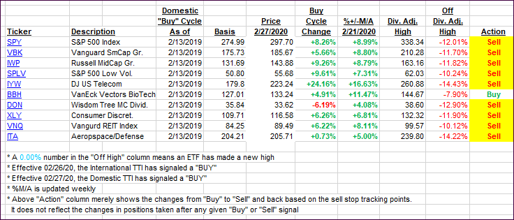
Click image to enlarge
Again, the %+/-M/A column above shows the position of the various ETFs in relation to their respective long-term trend lines, while the trailing sell stops are being tracked in the “Off High” column. The “Action” column will signal a “Sell” once the -8% point has been taken out in the “Off High” column. For more volatile sector ETFs, the trigger point is -10%.
3. Trend Tracking Indexes (TTIs)
Our TTIs headed recovered with today’s rebound of hope but remain deep on the bearish side of the trend line.
Here’s how we closed 03/24/2020:
Domestic TTI: -27.04% below its M/A (prior close -34.08%)—Sell signal effective 02/27/2020
International TTI: -24.11% below its M/A (prior close -30.27%)—Sell signal effective 02/26/2020
Disclosure: I am obliged to inform you that I, as well as my advisory clients, own some of the ETFs listed in the above table. Furthermore, they do not represent a specific investment recommendation for you, they merely show which ETFs from the universe I track are falling within the specified guidelines.
Contact Ulli