Europe is falling apart but the S&P 500 is having its best start to the year since 1989. I’m sure you are puzzled as to why equities have gone full steam ahead despite less than stellar fundamentals. While I believe this recent run-up will not last in the long-run, there are indicators that might suggest otherwise. Perhaps the answer as to where we’re going lies in the technicals.
The crossing of 50-day and 200-day moving averages is a key buy and sell trigger for some technical analysts. The Golden Cross is when the 50-day moving average crosses above the 200-day moving average, thereby generating a buy signal. Conversely, the Death Cross occurs when the 50-day moving average crosses below the 200-day moving average, resulting in a sell signal.
Seeing as a Golden Cross just happened this past Tuesday (January 31), does that mean we should go into major buy mode? Let’s get at the devil in the details.
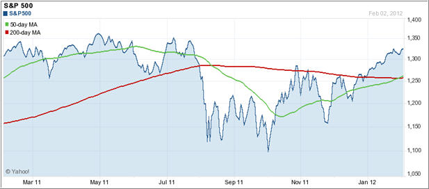
The chart below shows some instances of Golden and Death Crosses in the S&P 500, so there is some credence to these technicals. There is generally an extended rise following a Golden Cross and a protracted decline following a Death Cross.
Yet, there is a caveat with the Golden and Death Cross – there is a sizeable lag effect. For example, the most recent Death Cross for the S&P 500 occurred in mid-August 2011 at roughly 1,180 (see below). The S&P 500 had already fallen over 150 points from a pre-Death Cross high of 1,345 before the Death Cross. Thus, if someone sold at this instance, they would’ve absorbed nearly 70% of the loss seeing as the lowest low until the next Golden Cross was at 1,100.
[Chart courtesy of YahooFinance]Looking at the S&P 500’s most recent Golden Cross at roughly 1,312, assuming that an investor sold at the Death Cross at 1,180 and then re-entered the market right after the Golden Cross, they would’ve missed out on an 11% plus return. Buy high, sell low is not the name of the game.
Interestingly, history shows that the Golden Cross is actually a better indicator of upside momentum than the Death Cross is a sign of decline. Perhaps there’s a behavioral explanation for this phenomena that could better inform our perception of future market movements.
It’s possible that the cross signals hold up better among other indices and certain stocks. But looking at a broad based index such as the S&P 500, we have to interpret these technical signals with a grain of salt. I know it’s somewhat of a cliché to say that this time is different given the European turmoil and economic weakness at home in the U.S, but it really is.
I don’t recommend using the Golden Cross or Death Cross as a primary indicator to buy or sell. However, it’s something worth knowing as it can offer some insight as to where the market might be heading if there are other momentum indicators that support recent trends.
The recent Golden Cross might be a sign of more upside to come. Nevertheless, it’s critical to exercise caution in this volatile environment although the equities picture looks more attractive as of late.
Contact Ulli

Comments 1
I agree with the analysis of the golden/death cross issue particularly as the market retreats.
If the 50 and 200 day MA’s and the price are all moving up, what consideration, if any, should be given to incremental purchase of an ETF until the Golden Cross occurs. This could work in instances where an account is held and no trading cost is incurred (Schwab ETF’s and others).
Stops or trailing stops would be utilized to protect the downside.